The Universal Challenge: From Events to Insight
Every field that deals with streams of events over time shares a common challenge. A factory manager tracking items on a conveyor belt, a data scientist analyzing user clicks, and a network engineer monitoring packets are all trying to turn a series of discrete, often chaotic, events into meaningful insight. The tools may differ, but the fundamental problem is the same: how do we perceive the true nature of a system through the lens of the events it generates?
My own journey into this problem began with a network analysis tool, JitterTrap. I was seeing things that shouldn't exist: a prominent, slow-moving wave in my network throughput graph that my knowledge of the underlying system said couldn't be real. This "ghost" in the machine forced me to look for answers in an unexpected place: the field of Digital Signal Processing (DSP).
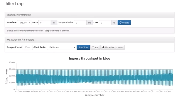 The "ghost" in the machine: a prominent, slow-moving wave that was an artifact of the measurement process, not a real signal in the network traffic.
This three-part series shares the lessons from that journey. Part 1 introduces the core DSP mental model as a powerful, universal framework. Part 2 lays out a theoretical framework for analysis, and Part 3 applies that framework to perform a rigorous, quantitative analysis of a real-world measurement problem.
Thinking in Dimensions
To understand the DSP lens, we must first reconsider how we represent information. A single piece of information can be a 1D point on a line (x) or an instant in time (t). Combine two, and you get a 2D representation, like a measurement's (timestamp, magnitude). This scales up. A greyscale video frame is 3D data: a grid of pixels (x, y) each with a brightness (magnitude).
The key insight is that we constantly project multi-dimensional data into a format that suits our needs. An old black-and-white TV receives a fundamentally 2D signal—a stream of (magnitude, time)—but uses predetermined timing information to project it into a 4D experience: an (x, y) position on the screen, with a given luminosity, that changes over time.
When we analyze a stream of discrete events, we are doing the same thing. We are taking a series of events, which could be modeled as (event_present, time), and projecting them into a new dimension: a rate, like "packets per second." This new dimension, this signal, is an artificial construct. And the moment we create it, we subject it to the laws of signal processing.
The Law of the Alias
The first law I had unknowingly violated was the Nyquist Theorem, which leads to a phenomenon called aliasing. In simple terms, to accurately represent a signal, you must sample it at a rate at least twice its highest frequency. If you fail to do so, that high-frequency energy doesn't just vanish. It gets "folded down" into the lower frequencies, masquerading as a slow-moving pattern that wasn't there to begin with. The ghost in my graph was the alias of a much faster, invisible pattern in the packet stream.
This immediately begs the question: how can you ever analyze a signal that has components faster than you can measure? The answer is that you must first filter out those high frequencies.
This led to the central insight: any time you aggregate discrete events into time buckets, you are already applying a filter. The very act of counting "items per minute" or "events per millisecond" is a filtering operation. You are taking a series of instantaneous events and "blurring" them into a single, averaged value for that time interval.
A visualization of the boxcar function, representing a simple count over a fixed interval. (Credit: By Qef - Own work, Public Domain, https://commons.wikimedia.org/w/index.php?curid=4309823)The Default Filter: A Leaky Boxcar
The problem is that the default filter everyone uses—a simple count over an interval, known in DSP terms as a "boxcar" filter—is not a very good one. It's convenient, but it has a poor frequency response, which looks like a sinc function. While it has deep nulls at frequencies corresponding to its interval (e.g., a 1ms filter has a null at 1 kHz), its "sidelobes" are high. The largest sidelobe is only attenuated by about -13 dB, meaning it allows roughly 22% of the signal amplitude at that frequency to "leak" through.
-13.26 dB corresponds to the linear amplitude of ~0.22 shown in the previous plot, representing the "leakage."
This is not a minor detail. It is the direct, mathematical explanation for the ghost in my machine. A strong, periodic component in the original signal at just the right frequency can leak through this sidelobe and appear as a coherent, low-frequency wave in the final data. This is a universal pitfall for any analysis based on simple time-windowed averages.
Conclusion to Part 1
Viewing event data through a DSP lens reveals the hidden operations we perform on our data. It shows that the simple act of counting events in time windows is a powerful, but potentially flawed, filtering process. It gives us a name for the ghosts in our graphs—aliasing—and a precise, mathematical reason for their existence in the leaky response of our default filters.
But this is just the first step. This initial insight, while powerful, rests on a simplified view of the world. Real-world signals can be chaotic and non-stationary, and our measurement tools are themselves imperfect and "jittery". To build a trustworthy instrument, we must confront these messier realities.
Before we can quantitatively analyze these imperfections in Part 3, we must first build a more formal framework. In Part 2, we will create a "Rosetta Stone" to connect the core concepts of sampling, filtering, and frequency, giving us the tools we need for the final analysis.
Continue to Part 2: A Framework for Analysis.